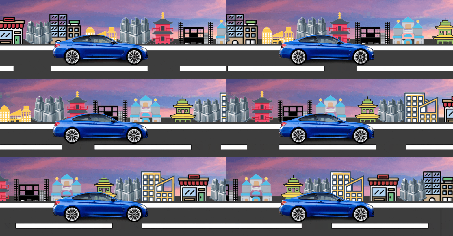
In this article, we will design a moving car animation using HTML and CSS. This animation creates a smooth running car effect on a road and background. It creates a realistic motion effect.
HTML creates a basic structure of the moving car animation, and CSS properties add styles and animation effects.
Filename: index.html
<!DOCTYPE html>
<html lang="en">

<head>
    <title>
        Moving Car Animation Effect
        with HTML CSS JavaScript
    </title>

    <link rel="stylesheet" href="style.css">
</head>

<body>
    <div class="main-container">
        <div class="road"></div>
        <div class="road-sideview"></div>
        <div class="moving-car">
            <img src="bmw.png"
                alt="moving-car">
        </div>

        <div class="car-wheel">
            <img src="wheel.png"
                alt="moving car wheel"
                class="car-back-wheel">

            <img src="wheel.png"
                alt="moving car wheel"
                class="car-front-wheel">
        </div>
    </div>
</body>

</html>
CSS properties are used to add styles and animations for moving the car. There are some styles that we are using while creating a moving car animation effect. These are –
- Set the padding and margin of the body element.
- Set the width, height, and background image of the main-container class.
- Set the road image width, height, and position.
- Set the city image as a background image to make the effect better.
- Set the animation of the car image.
- Set the motion of two front wheels to make the moving effect.
Filename: style.css
* {
    margin: 0;
    padding: 0;
}

.main-container {
    height: 100vh;
    width: 100%;
    background-image: url('sky.jpg');
    background-size: cover;
    background-position: center;
    position: relative;
    overflow-x: hidden;
}

.road {
    height: 220px;
    width: 500%;
    display: block;
    background-image: url('road.png');
    position: absolute;
    bottom: 0;
    left: 0;
    right: 0;
    z-index: 1;
    background-repeat: repeat-x;
    animation: road 5s linear infinite;
}

@keyframes road {
    100% {
        transform: translateX(-1400px)
    }
}

.road-sideview {
    height: 130px;
    width: 500%;
    display: block;
    background-image: url('city.png');
    position: absolute;
    bottom: 200px;
    left: 0;
    right: 0;
    z-index: 1;
    background-repeat: repeat-x;
    animation: road-sideview 5s linear infinite;
}

@keyframes road-sideview {
    100% {
        transform: translateX(-1400px);
    }
}

.moving-car {
    width: 500px;
    left: 50%;
    bottom: 30px;
    transform: translateX(-50%);
    position: absolute;
    z-index: 2;
}

.moving-car img {
    width: 90%;
    animation: moving-car 1s linear infinite;
}

@keyframes moving-car {
    100% {
        transform: translateY(-1px);
    }

    50% {
        transform: translateY(1px);
    }

    0% {
        transform: translateY(-1px);
    }
}

.car-wheel {
    left: 50%;
    bottom: 178px;
    transform: translateX(-50%);
    position: absolute;
    z-index: 2;
}

.car-wheel img {
    width: 65px;
    height: 65px;
    animation: car-wheel .5s linear infinite;
}

@keyframes car-wheel {
    100% {
        transform: rotate(360deg);
    }
}

.car-back-wheel {
    left: -170px;
    position: absolute;
}

.car-front-wheel {
    left: 80px;
    position: absolute;
}
After combining the above HTML and CSS code, we will get the moving car animation effect.

Images files with their names –